Walton Property Management — Brand, web, and operations
Walton doesn’t list every property on the Gulf Coast—they curate a small portfolio of homes worth the guest experience and the owner relationship. The work was to make that posture legible online, then back it with operational clarity so the brand wasn’t just a pretty shell.
Brief
Most property management sites blur together: stock sunsets, generic trust badges, a contact form. Walton showed up with a sharper stance—selective, quality-first, human. The design job wasn’t only to look premium; it was to feel true to how they operate.
Problem — two audiences
- Guests need to believe the stay will feel considered before they book—not another interchangeable listing.
- Owners need proof of competence—revenue, care for the asset, and less operational noise.
Speaking to both at once usually convinces neither. The site architecture had to give each audience a clear lane while sharing one visual language.
Research
I mapped how competitors split visually and editorially. The category tends toward two poles: operations-first platforms (efficiency, systems) and luxury lifestyle brands (aspiration, gloss). Walton sits between—serious operationally, experiential in product. The design had to read clean enough for trust and warm enough for care.
Brand identity
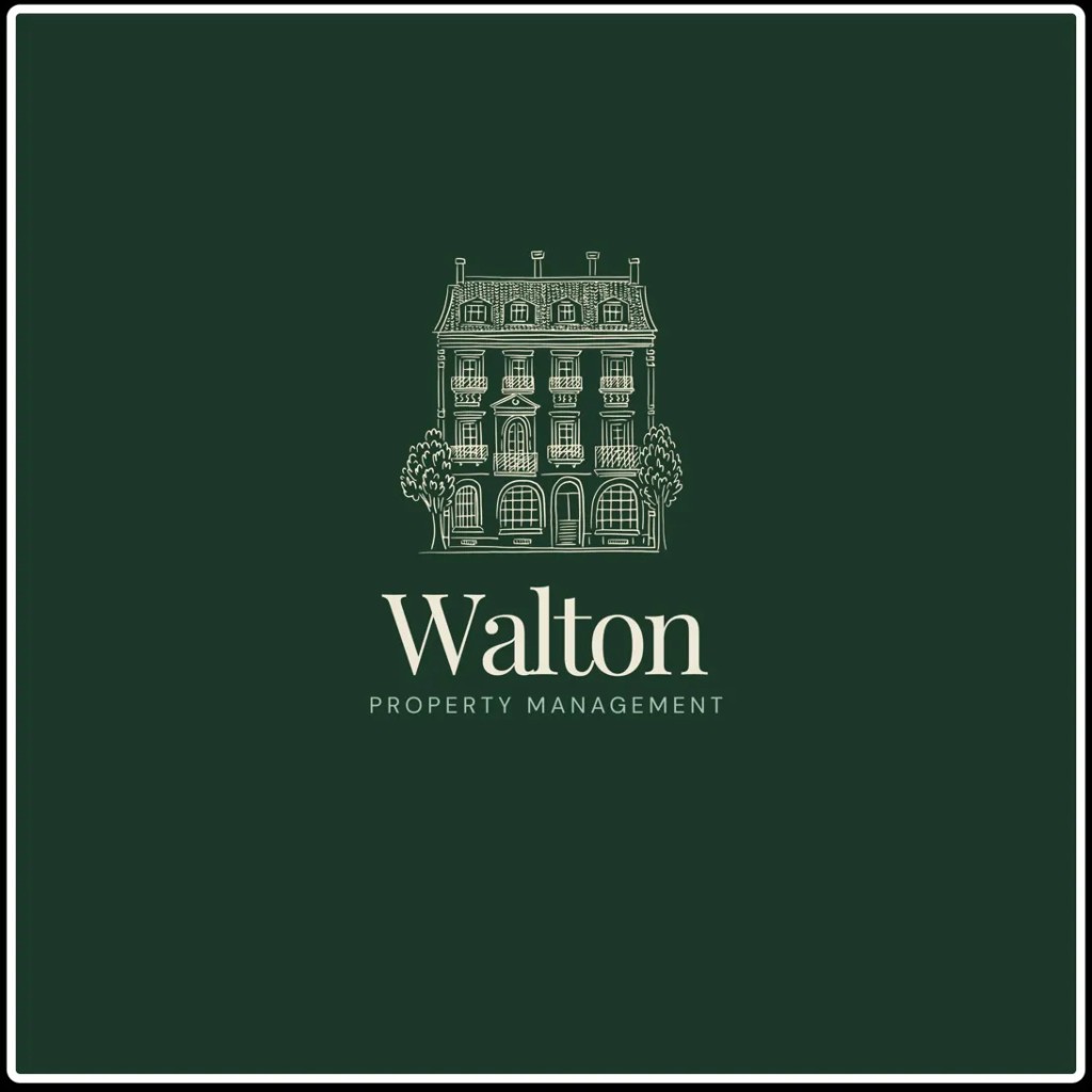
The mark centers a hand-drawn manor illustration on deep forest green with a cream wordmark—formal craft, not stock photography. Supporting choices:
- Color in the #1B4332 range — grounded, natural, premium without default rental-site blues.
- Type: high-contrast serif for “Walton,” tracked caps sans for “PROPERTY MANAGEMENT”—editorial personality up top, clarity underneath.
- Illustration over photo or flat icon: signals intention and curation.
Website
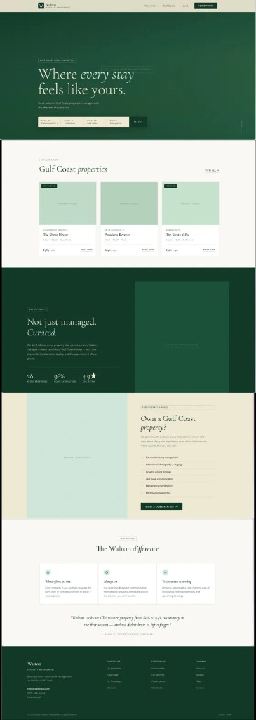
Hero leads with guest outcome—“Where every stay feels like yours”—with an inline search (location, dates, guests) so booking intent starts immediately.
Listings read as editorial cards: location, beds/baths, rate, and human signals like “New listing” / “Trending.”
Curation block (“Not just managed. Curated.”) carries differentiation before raw stats—28 properties, satisfaction, ratings land as proof after the story lands.
Owners get a dedicated section: services (photography, pricing, comms, maintenance, reporting) and a low-pressure CTA—Start a conversation.
Footer splits navigation by audience (Properties · For owners · Company) so the dual-client structure holds to the last click.
Operations & systems
A strong site on a weak operating model is a liability. I mapped how Walton would run—onboarding, guest journey, owner cadences, maintenance branching, reporting loops—and paired it with a pragmatic tool stack (PMS/channel manager, dynamic pricing, access, noise monitoring, cleaning ops, Notion for SOPs and owner dashboards, accounting, intel).
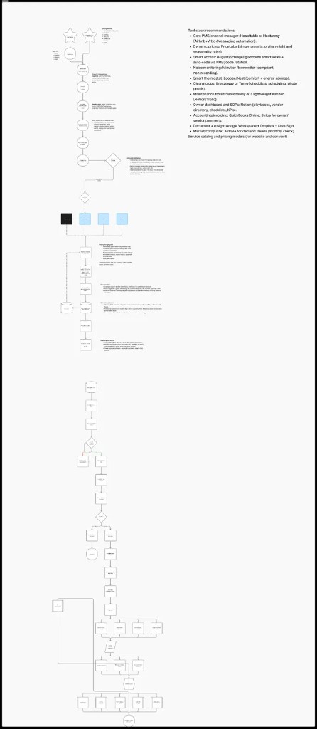
Tools named in design are recommendations for implementation; final vendor choices sit with the client.
Principles
- Premium without exclusion — considered, not cold.
- Curation as differentiation — selectivity over generic “we manage everything” claims.
- One system, two journeys — guest and owner paths stay distinct inside shared visual language.
Deliverables
- Competitive landscape scan and inspiration map
- Brand system — logo, color, typography, usage notes
- Responsive website design — desktop and mobile
- Operational diagrams — onboarding, guest journey, maintenance, reporting
- Tool stack and service catalog framework
Reflections
Design is complete; launch timing and which tools ship first stay with the client. The piece I’ll carry forward is pairing editorial brand work with operational truth-testing early—so marketing never promises a machine the team can’t run.